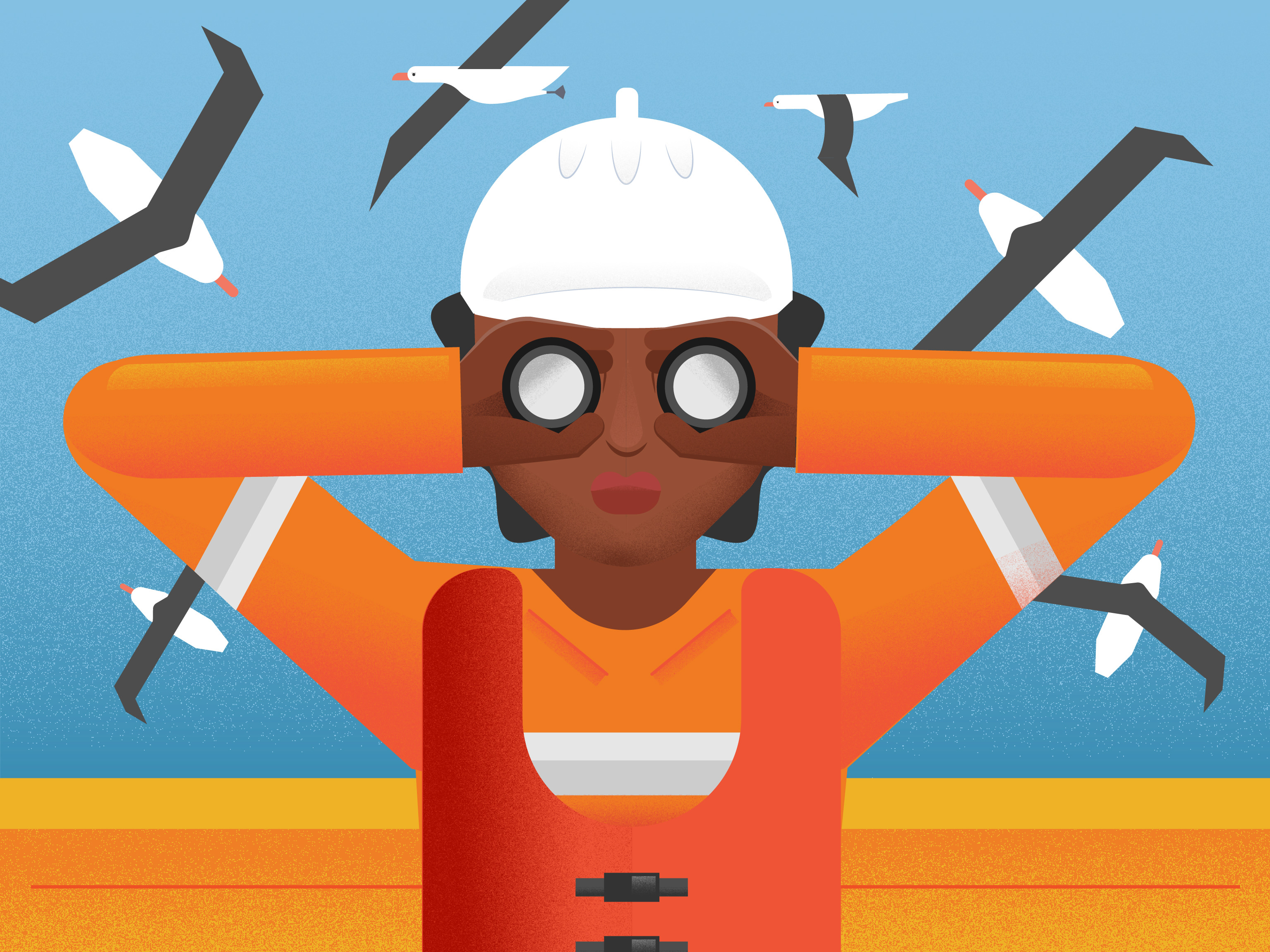
Initial sketch
Final
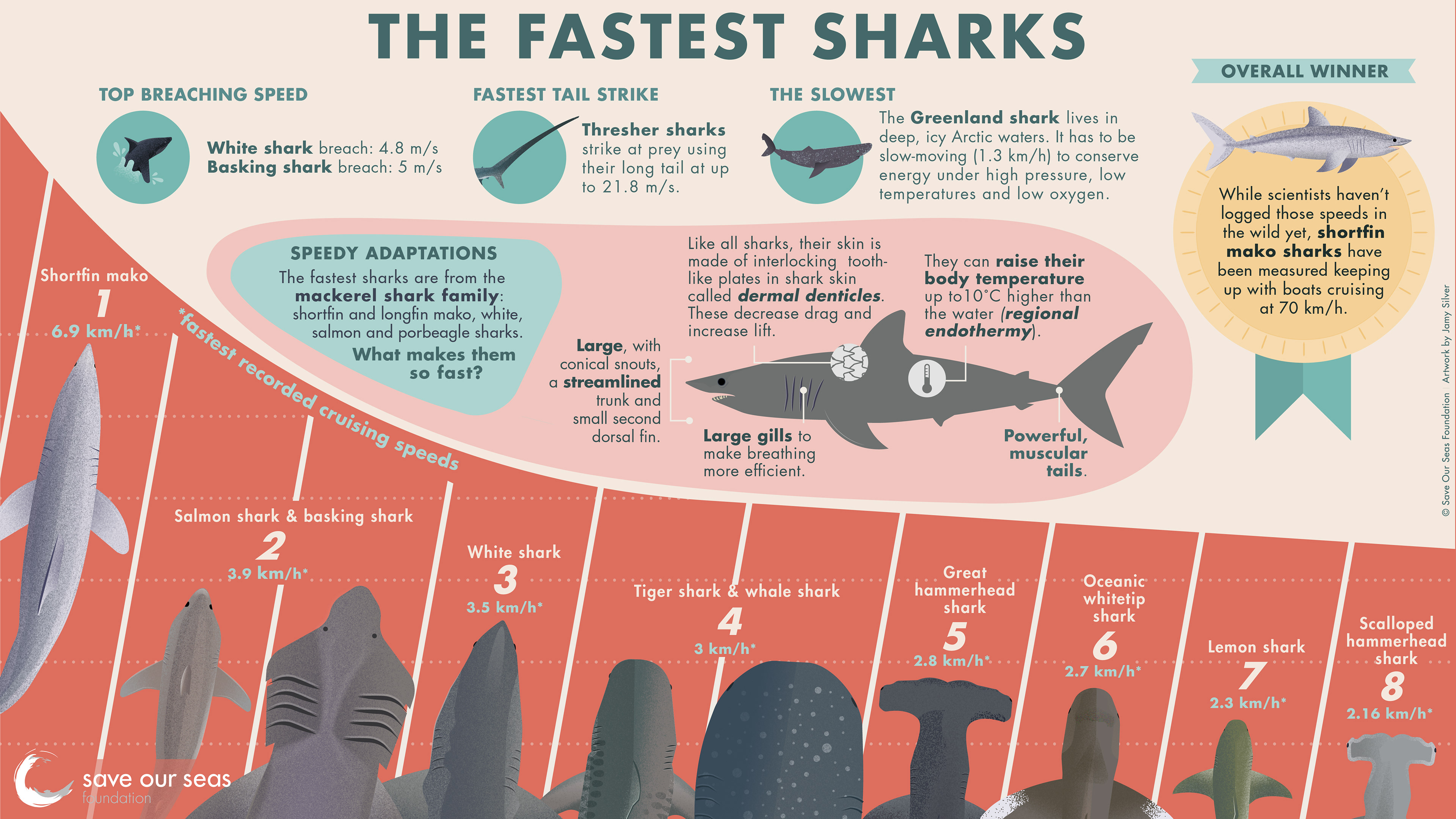


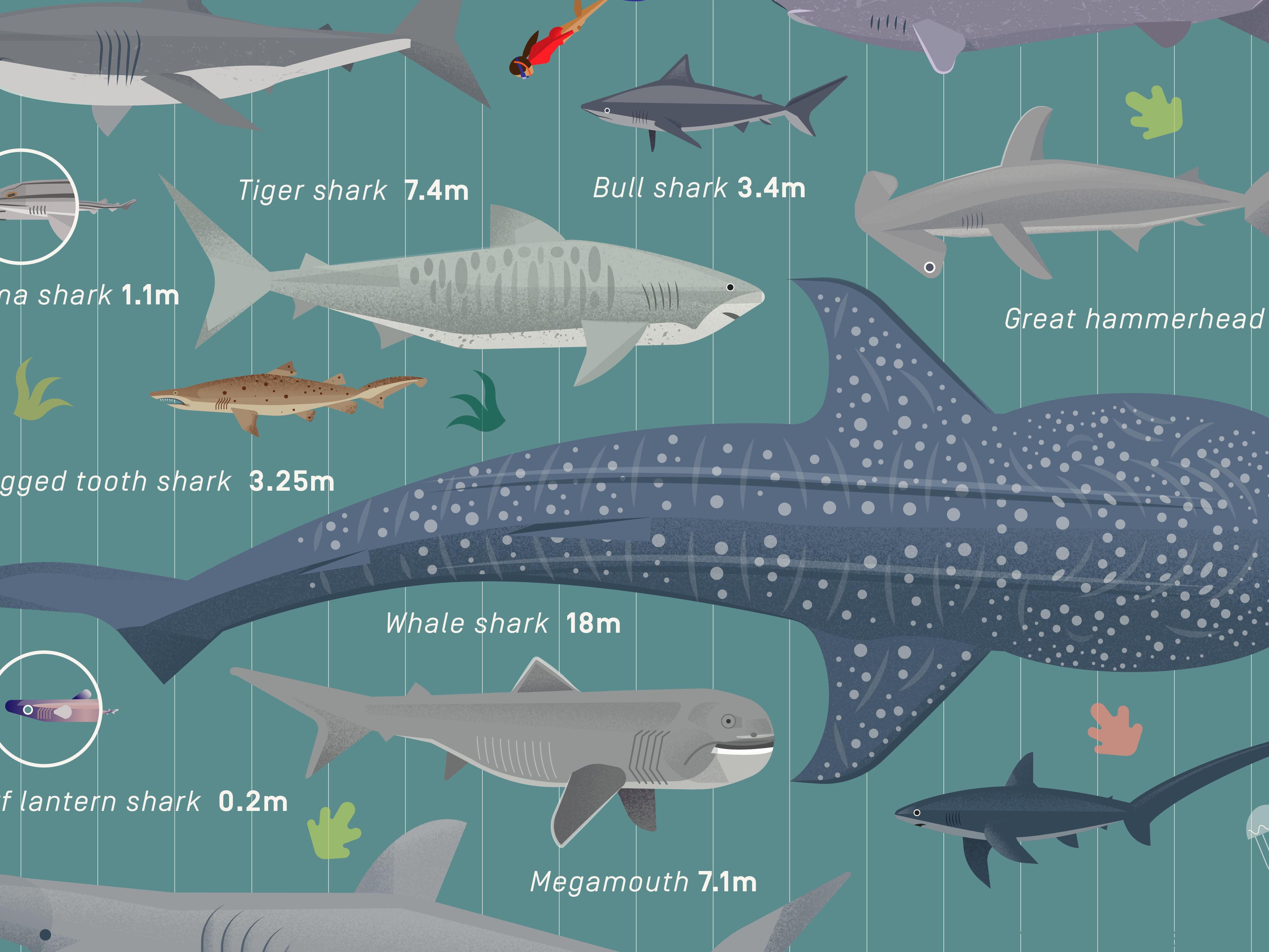
Fun infographic I made with the Save Our Seas Foundation (SOSF) for their World of Sharks website - an excellent resource for the shark-curious. In classic science communication fashion, what we initially thought was going to be a very straightforward retelling of simple data turned out to be a lot more nuanced. Sharks come in a huge variety of shapes and sizes with different adaptations for a wide range of environments and life histories, and comparing speeds can be like comparing apples to oranges. Their accompanying article dives deeper into these nuances, but this is a good example of how a lot of the work of a science visual is behind the scenes: to weave a narrative from the research that is accurate, yet easily understandable to its audience (in this case, a shark-interested public) and present that in a way that feels intuitive and effortless to engage with. I worked with a science writer to organise and whittle down the salient information into an order and captions that maintain accuracy while keeping the balance of the overall graphic.