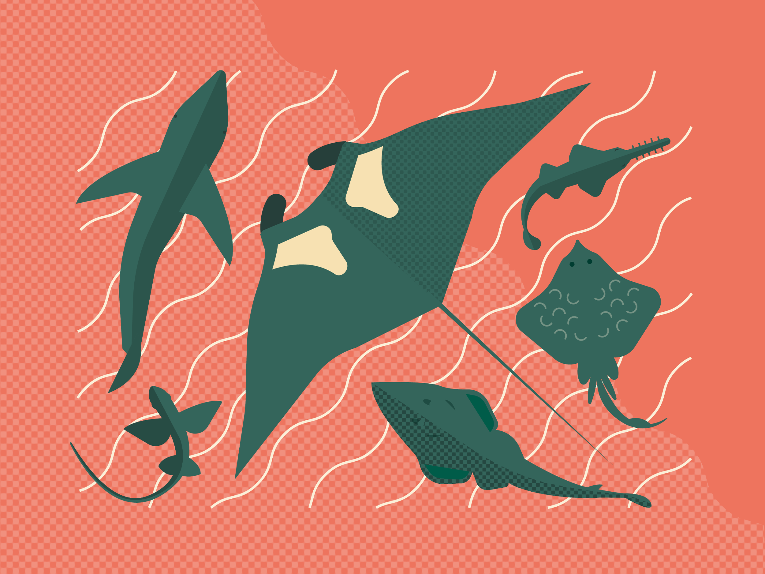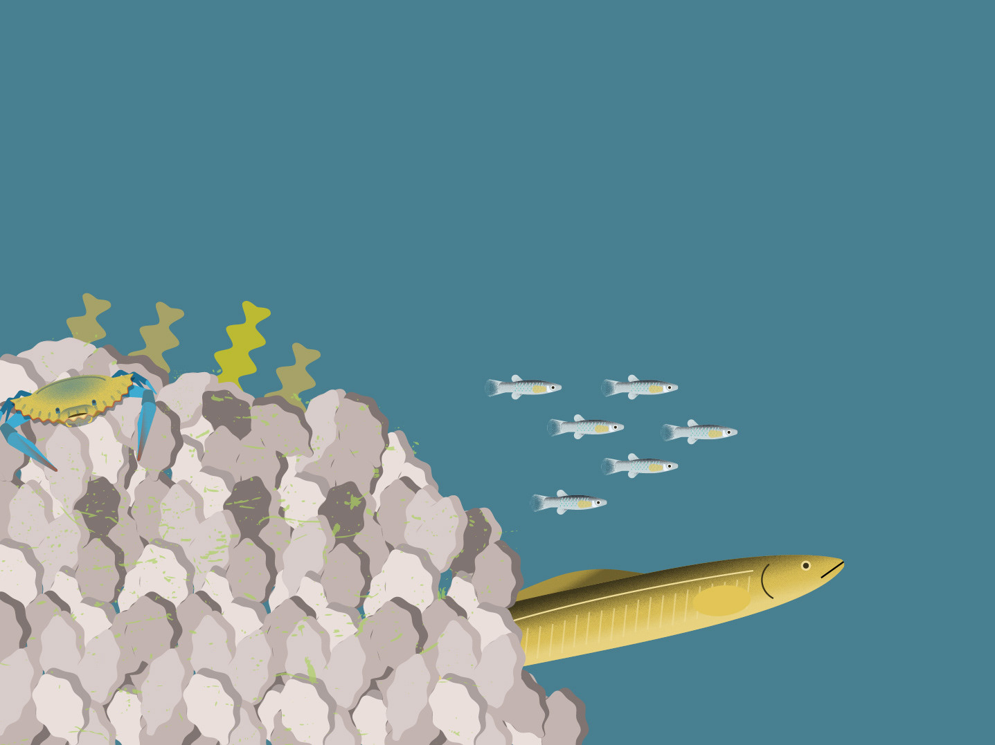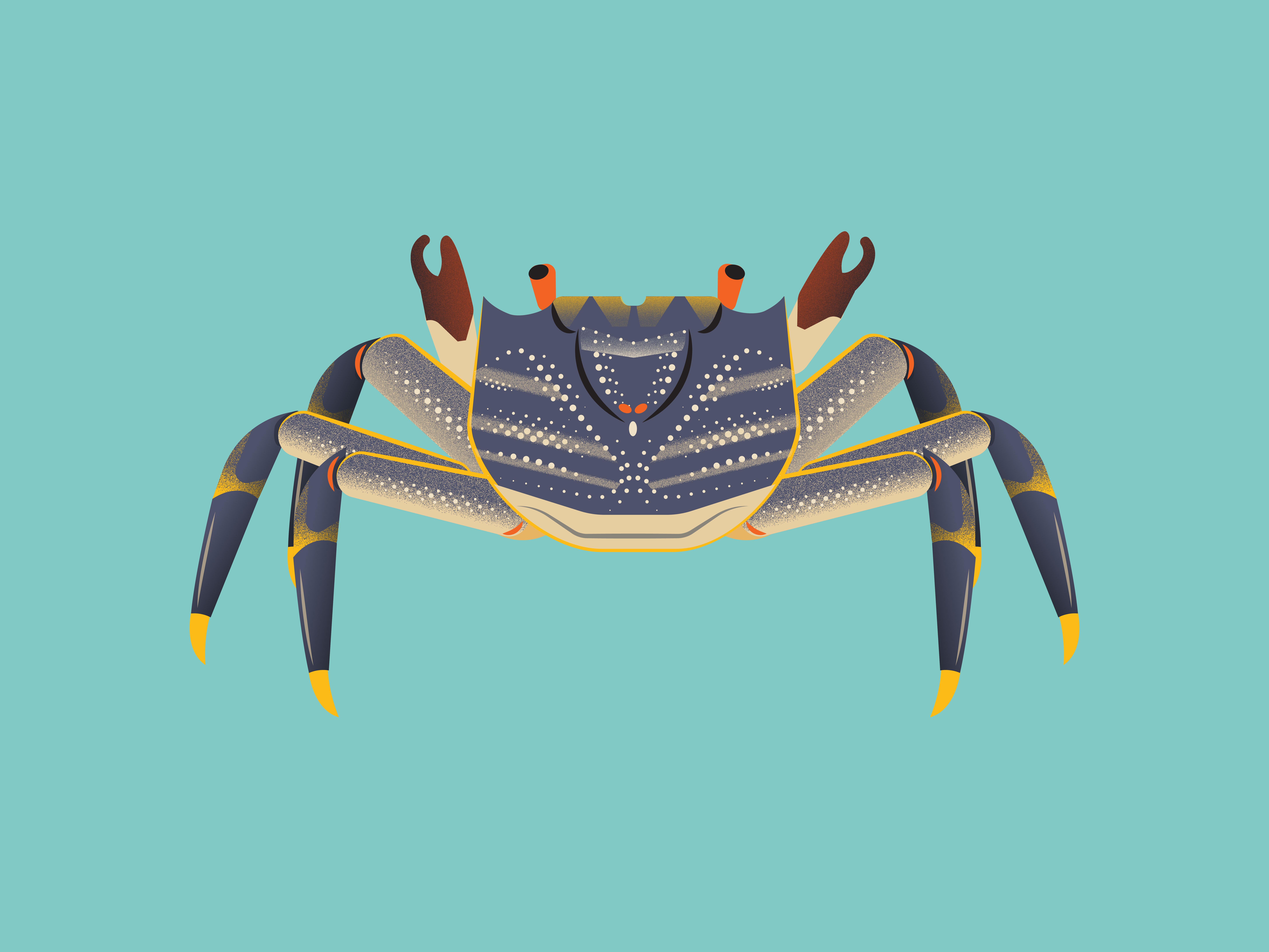

An fun infographic for World of Sharks, a website dedicated to being the most accurate and comprehensive resource for all things shark-related. To make this graphic really easy to engage with and understand, I represented them all on one page with a scale and human for intuitive context and comparison.
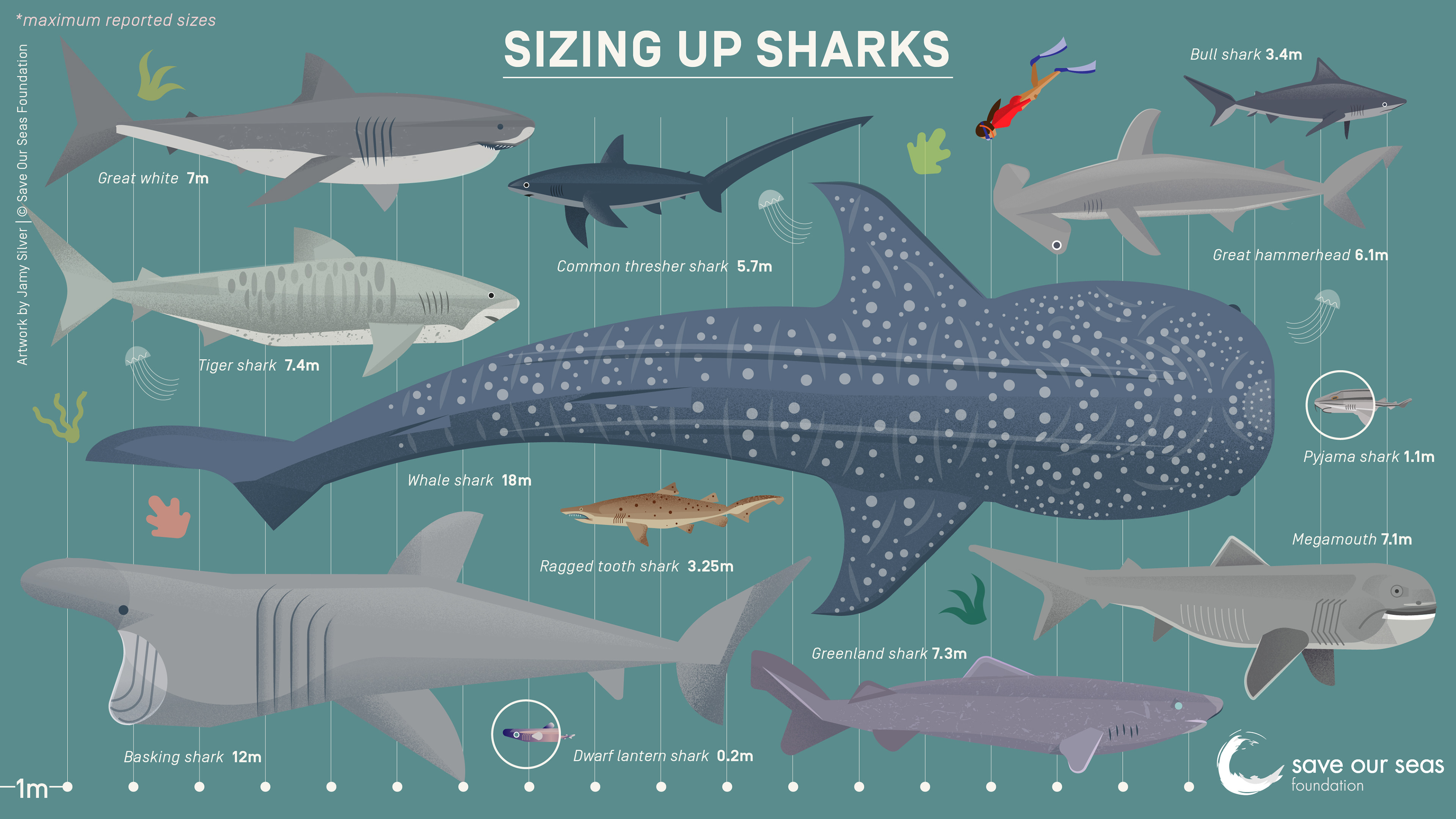
SOSF Shark Sizes infographic
You may also like
OneWorld Data Visualisation
Case study: K4Sea report summary
Birdlife's Albatross Task Force animation
D'Arros Research Centre 10 Year Anniversary infographic
Saving Sandfish infographic signage
The Nature Conservancy Flow animation
IUCN Sharks, Rays & Chimaeras Status Report infographic
The Nature Conservancy Aquaculture infographic
SOSF D'Arros Experience snorkelling guide
SOSF Greeting card